World Fine Art Professionals and their Key-Pieces, 123 - Ditty Ketting
World Fine Art Professionals and their Key-Pieces, 123 – Ditty Ketting
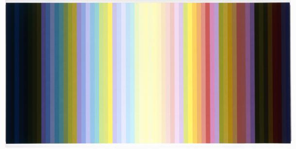
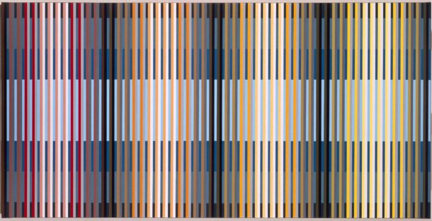
At Masters of Rotterdam I saw a large elongated painting with narrow horizontal color boxes with many colors, of which blue was the dominant. Over the color areas were thin white gray and black verticals, a kind of bars, which seemed to allow you to pull the colors upwards, as luxury blinds.
The painting was made by Ditty Ketting, Untitled, 391, made in 2013. A few months later I’m in the studio of Ditty Ketting in Pernis. By subway I went there. I saw refineries, pipes, storage tanks and cranes, but as I left the subway train I landed in a green garden area with low houses.
Color
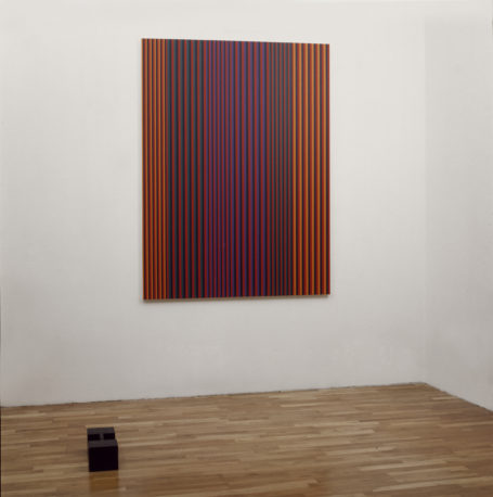
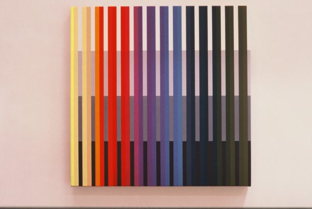
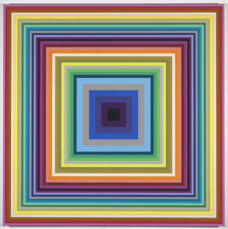
Ditty Ketting’s studio, which is next to her house, has nothing to do with the refineries landscape. It is a light, comfortable, organized space with on the wall at left a large work (1.20 x 2.10) with squares in all colors. In front of me, a smaller work with vertical strokes and a big work, the same size as the first, with colors in vertical strokes, above lighter colors, including saturated and at the bottom black colors. On a table there are dozens of pots of acrylic paint, systematically arranged.
She makes all the paintings on the table we are sitting at. In addition to the brush, the ruler is an important tool. Ditty Ketting: “In the past, I made them standing, but it’s inconvenient to draw precise lines on a staircase.” Color is her theme, that’s clear. And especially the effects of colors relative to each other. “How the colors let us experience the light, and create a painting space.”
Josef Albers
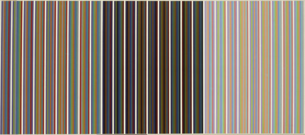
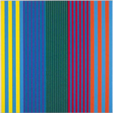
Immediately after graduating from the Academy of Fine Arts Rotterdam in 1980, she started. At the Academy itself, the use of color was still sparing, but it was already about level and line. She took the colors of Bauhaus / Mondrian and added green. But four colors were ultimately too limited. “The color selection is large. I was looking for something to hold on to. Then I read a chapter in the book “Interaction of Color” by Josef Albers, who was associated with Bauhaus. He talked about the phenomenon that when you put colors in vertical lanes next to each other, there is hardly any shape, so it only depends on the effects of the colors relative to each other. That’s what I started with and I did that for years. “She put together a color circle of 14 colors.
The color names are the names she found on tubes of acrylic paint: pale yellow, deep orange, orange red, crimson, magenta, magenta violet, ultramarine blue violet, ultramarine blue, permanent blue, turquoise blue, phthalo green, emerald and green yellow. From each color she made four tones. A total of 56 shades.
Turning point
She made all sorts of discoveries when she started with her vertical color bars next to each other. Certain colors were very dominant, other modest, certain combinations worked very well, others less. “I experimented a lot. With the colors of the color schemes, the color system I used, etc. “All works were numbered.
Number 1 was a screen printing with black shifted squares. She was still working on paper at the time. But soon she worked on stretched linen. At a steady pace, she made one work after another until a change took place. That was in the year 2000. “I was in search for a deeper space in the painting, with horizontals in the background and the verticals over it. On the first canvas I made a base in two parts, above light gray and under dark gray and over it the verticals. I realized that as I continued in this way, I would open up a lot of possibilities. It would be more complex as well.”
Spatial effects
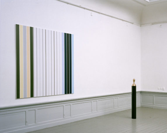
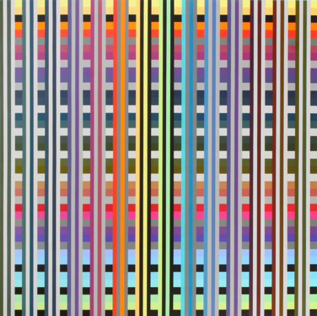
But the verticals did not completely disappear, they came in front of the horizontals, like thin “pillars”, placed over the color tiles. As a key work, a work that shows this transition best, she mentions Untitled, 175. She shows me a slide. The surface does not stop at the edge of the painting, but continues to the sides. Those are pretty thick. The vertical lines go from edge to edge. When she paints she does each rectangle some five times, some even more. In black it is not necessary, then three layers are enough.
The response to this transition was very good. The work was found more accessible, the spatial effects were more visible. The people wanted to buy and galleries wanted to show it. “I was lucky enough to work with MK Gallery in the Witte de Withstraat. They were excited about my work and that enthusiasm struck.”
The painting life is quite intense, she says. “I’m working on it every day. Working on a painting, I get ideas on how to proceed in future work. For example, I intend try to try out the contrast between the color tones more extensively.” Without directing it, she appears to make every year 11/12 new works. She is now at Canvas No. 438.
New series of colors
She is busy making a new series of colors. She points to one of her first works with very light colors. “I’ve taken those ‘old’ colors. So far, I used 14 colors in four tones, now a fifth tone is added. Then I have 60 colors.” On a smaller table are the light colors. Two must be made lighter so that a good balance is obtained. With those extra colors she can make more variations. “The light side becomes more extreme, which I could also describe as a turning point. But it’s a smaller turning point than that in 2000. It’s in smaller steps.”
Who are her great examples? “With Mondrian I feel related. And further with Ellsworth Kelly, Sean Scully and Josef Albers of course. He still is a great inspirator.”
She continues to search for the effect of color. And also how you best represent it. “that it radiates”. When a work is finished, there is the moment when she suddenly sees the effect of the plan. “These can be very happy moments.”
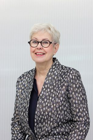
Images: 1) Untitled, 150, 2000, 2) Untitled 120, 1998, 200 x 200 cm, 3) Untitled, 198, 2003, 50 x 50 cm 4) Untitled, 280, 2006, 168 x 168 cm, 5) Untitled, 317, 2008, 108 x 108 cm, 6) Untitled, 360, 2011, 73,5 x 98 cm, 7) Untitled, 366, 2013, 84 x 224 cm, 8) Untitled, 378, 2012, 84 x 112 cm, 9) Untitled, 422, 2016, 40 x 40 cm, 10) Portrait Ditty Ketting.
Photos: 1 – 9 Bob Goedewaagen, 10) Solange Frankfort
http://www.dittyketting.nl/ https://vimeo.com/95374980
http://ifthenisnow.eu/nl/verhalen/de-wereld-van-de-rotterdamse-kunstenaar-26-ditty-ketting
Disclaimer: The views, opinions and positions expressed within this guest article are those of the author Walter van Teeffelen alone and do not represent those of the Marbella Marbella website. The accuracy, completeness and validity of any statements made within this article are not guaranteed. We accept no liability for any errors, omissions or representations. The copyright of this content belongs to Walter van Teeffelen and any liability with regards to infringement of intellectual property rights remains with the author.





The opinions expressed by individual commentators and contributors do not necessarily constitute this website's position on the particular topic.