World Fine Art Professionals and their Key-Pieces, 124 - Ropp Schouten
World Fine Art Professionals and their Key-Pieces, 124 – Ropp Schouten
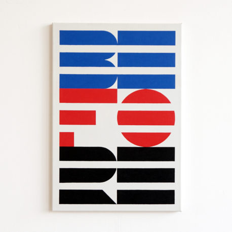
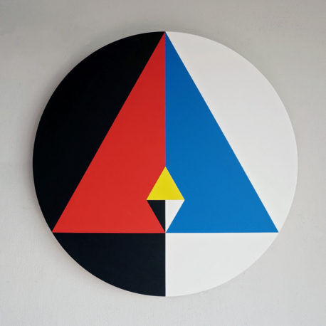
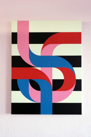
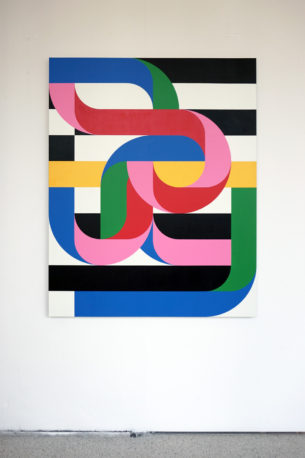
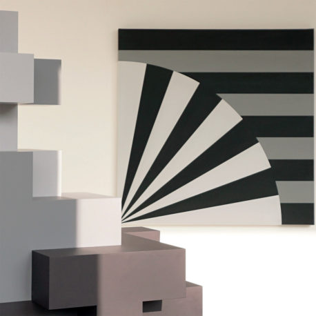
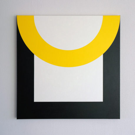
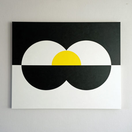
A work by Ropp Schouten you will recognize immediately. He creates playful abstract paintings with circles, triangles, squares in pronounced colors that tell something in a playful way.
His graphic designs not only find their expression in visual work, but also in textual. For many years, Ropp Schouten is the visual man of the ‘Mwah tekstuele verwenners’ duo. The Mwah creations – short crisp texts that create a smile – are now known not only in Rotterdam but also in the rest of the Netherlands.
Mwah
Ropp has taken the book ‘Wie dit leest is te gek’ (Whoever reads this is far out) with him. As I browse it, I see indeed very funny short sentences. I remember now that I read the texts a few years ago on the walls of the seventh floor of the Nhow Hotel, part of De Rotterdam, the three towers of Rem Koolhaas next to the Erasmus bridge.
With Erwin Pols, whom he met in 2007, he started Mwah. “He is a star in language. I elaborate it in images. It’s a very natural collaboration. “When the Concert Hall De Doelen was renovated, there were thirteen Mwah texts on the hundred-meter-long construction shoot. They were related to the theme music, sound and tone.
At the opening of the new Rotterdam Central Station the texts were also visible on the balustrade at the front and back of the building and on the sides of the elevator shafts. At the Rotterdam literary festival Geen Daden maar Woorden (No Deeds, but Words) the two did in consecutive years performances using the texts. “We gave the public compliments instead of hypocritical words.”
Tattoos and skateboards
Ropp is an autodidact graphic artist. He spent a few months on the Graphic Lyceum, but then went to work in the graphic world as a offset printer. “From an early age I had a great love for drawing. My bedroom was full of drawn tattoos and I was a big fan of skateboarding and the graphics that belonged to it. My father had a canoe on which he had his own ‘stripes’ designed in red, yellow and blue. It fascinated me.”
For quite a while, Ropp drew tattoos of women, skulls and snakes. When he started to work with photoshop and illustrator, he made flyers and posters for a disco. In the printing company where he went to work he got to know typography. “A nice mix. The typography I applied to flyers and house styles. I was experimenting a lot.”
Things he makes now often come from that period. “Sometimes abstract, the other time figurative or illustrative. Sometimes I use language to express a paradox or a direction.”
The beauty of simplicity
Ropp is painting for about three years now. He likes working without a plan. “I always enjoy making pictures, now in a clear form, I like more than before to share the work. It is the beauty of simplicity. In the last twenty years, I have been involved in it, but not that pronounced. I work with different layers. I notice that I am pleased to talk about it every now and then. ”
Essence
Ropp Schouten is looking for essence, in all his creations. “I strive for a clear form, which for example illustrates a duality. The Yin Yang symbol is a beautiful example. That’s such a strong symbol, so compact and contains so much knowledge. As my experience grows, I find it ever more beautiful. Everywhere you see visual shapes, structures, color, logos, objects, etc. We grow up with it. I am now graphic designer for 16 years and I experience more and more what feeling and joy shapes and colors can evoke.
There have been symbols for thousands of years, in general they have a religious origin. Schouten: “In a compact form, they represent the world we share, even though we are no longer so familiar with the religious beauty. It is interesting to look at it with a fresh and contemporary perspective. Then you see that many teachings are directed outward in contrast to oriental religions and wisdom. Those are aimed inwardly. Inside is where it always happens and is. There is a beauty to rediscover. I try to express this in my work every now and then.”
The end of knowing
It’s about approaching the human condition, says Schouten. “What is the essence of being human? You see that there are many conflicts, far from you, but also at the micro level. And that’s exactly where you are already. The image of a world is what you create and the brain makes a story about it. What we share is a story, it lives and dies at the same time. Parents go apart for example. Why does that happen? Why do we cry and why do we smile? If I would put my theme in one word I would say: Love. Despite all the ugly expressions of humanity, that is also part of the dual laws we live in. Imagine that you can recognize those laws to the essence. You come to a moment in your life that you think ‘I understand it all, all that’s happening’. It might not be true at all. Then you can ‘ground’ your life better. ‘
“It is, as it were, a higher form of knowledge. Not to be confused with the knowledge from a booklet. You could also formulate it as the knowledge that can lead to the end of knowing. What already exists beyond the usual mental boundary. ”
Schouten: “Fortunately, knowledge has been on the streets or, in the meantime, at your screenplay, but it is you who has the wisdom in mind. And that’s a huge wealth. It’s stupid if you neglect it while you live.”
In some of Ropp’s works you can see a triangle. “That’s a symbol of things you often find. For example: in the 24 hours in a day, there are three states to discover: wake up, sleep, dreamless sleep. We are the dot in the middle of the triangle, we are the ones who know all three states. The dot could also be called the fourth state. The dot is the knowing self. We do not only dream in our sleep, but we also dream when we are awake, and that seems to be the only reality. Just let the dream be real and at the same time not. Even in paradoxical terms you are no longer safe.”
More abstraction
Everything that is relevant ceases to exist and that after a second. “You know it’s true and not true at the same time. It is the old knowledge that has been lost. There is a beauty that I would like to convey through my work. The world seems to be fragmented, there seems to be no more wholeness, but there is. I hope we rediscover ourselves. It will only be fun if you recognize yourself in whom- or whatever. For me, it’s a great thing to be involved with.”
His works are increasingly moving towards abstraction. In that, ‘object and subject’ are dissolved. “We feel very pleasant when we can dissolve into something. You solve in time, which simply doesn’t exist. There does not seem to be anything. However, the action assumes that you make a conscious effort to enter and stay there. That is not necessary eventually. One can not without the other, and the other can not without the one. The pain and joy can make you feel alive in life. Feeling is as abstract as possible. Abstraction arises from us people without a firm hold. I was once in Museum Boijmans and saw a great work by Martin Assig with the text ‘Du hast die ganze Welt getragen’. That struck me, because that goes for everyone.”
Key work
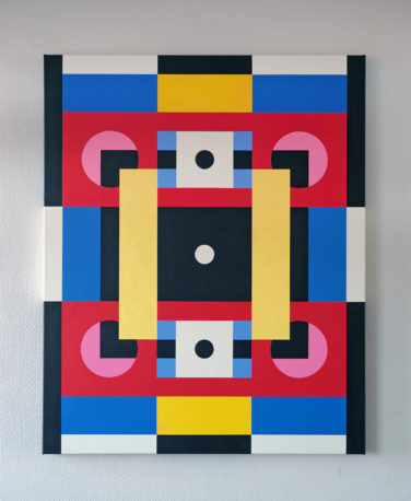
Does he have a key work, a work that served as a tipping point? That seems to be the case, it is ‘Untitled 2’. We see a white dot in the middle and from there squares and multiple circles that communicate with each other. A black and white border surrounds it. “It symbolizes the spiritual tendency in which we often find ourselves. We think we are what we think, but that’s something we create ourselves without understanding it. With the white dot in ‘Untitled 2’, we may again realize what we are. What you are is a whole different thing than who you are. If you rediscover what you are, it will coincide.”
Mondriaan had also discovered this, according to Schouten. In his expressions there is a lot of symbolism. His explanation: “A horizontal line represents the imaginary birth and death and the vertical line stands for the metaphysical. These two are at the same time active. Mondrian has evolved, from figurative to abstract. Oriental thinking played a key role, Jiddu Krishnamurti from India, in particular. Mondriaan expresses it so minimal, he is a genius.”
Schouten hopes he can continue to design, and that, in addition to Mwah, he can actually earn an income out of it.
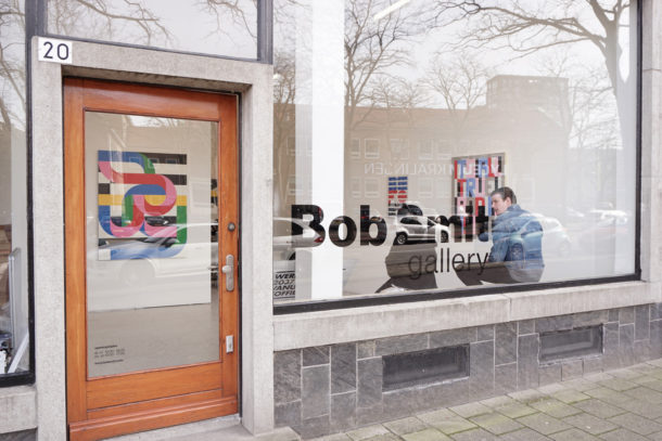
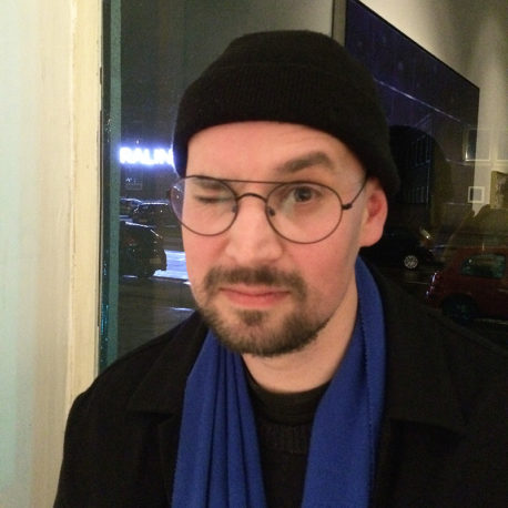
Images: 1) before, 2) Bob Smit Gallery, 3) Circle III, 4) Crossings I, , 5) Crossings II, 6) Self-portrait, 7) Under the illusions, 8) Untitled III, 9) YPU-2016, 10) Portrait Ropp
http://ifthenisnow.eu/nl/verhalen/de-wereld-van-de-rotterdamse-kunstenaar-27-ropp-schouten
Disclaimer: The views, opinions and positions expressed within this guest article are those of the author Walter van Teeffelen alone and do not represent those of the Marbella Marbella website. The accuracy, completeness and validity of any statements made within this article are not guaranteed. We accept no liability for any errors, omissions or representations. The copyright of this content belongs to Walter van Teeffelen and any liability with regards to infringement of intellectual property rights remains with the author.





The opinions expressed by individual commentators and contributors do not necessarily constitute this website's position on the particular topic.