World Fine Art Professionals and their Key-Pieces, 44 - Nicole van Schouwenburg
World Fine Art Professionals and their Key-Pieces, 44 – Nicole van Schouwenburg
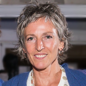
Are there any Hague artists who use Delft Blue, in one way or another, I asked myself a while ago. I asked around at the Meesterlijk, a Design and Crafts Event in Amsterdam’s Westergasfabriek. I received the answer that there were indeed. One of the namest hat were mentioned first was that of Nicole van Schouwenburg.
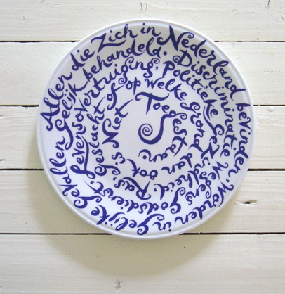
I made an appointment with her. In her house on the Laan van Meerdervoort, she told me how it all began. ‘I do calligraphy and I quite like it. Preferably with brush and blue ink. If possible with panache and curls. In 2005 I got the idea to paint a plate with a text that runs from outside to inside, in away that the text becomes a decoration.
It looks like Delft Blue
‘At one point I thought: It looks like Delft Blue! I asked a friend, Irene Klinkenberg, to write some lyrics and I showed a sample plate to a company in Brabant. With a trial plate at hand I went to Royal Delft, full name then De Koninklijke Porceleijne Fles / Royal Delft.
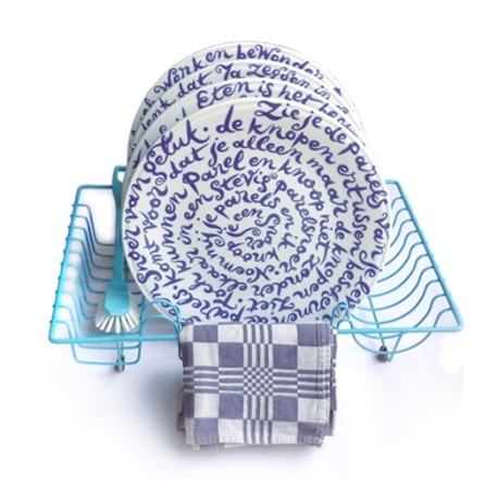
There I met a nice interim-director, Ilja van Haaren, who was keen to win new artists. She immediately saw in my plate an opportunity for a good product. She had a creative mind. We went for a first series, eleven with Dutch texts. A series of provocative statements as a basis for a lively table conversation.
In the laboratory we tested the best blue color and the best type of plate. A nice artisan part of the process. Royal Delft kept the circulation limited, 250 pieces per text, it would make it more exclusive, Ilja thought. She then said that if it sold out after three years, we would dance on the table.’
Diskus
‘The name of the product was Diskus, which refers to the Greek word for plate or disc. It also refers to ‘to discuss’. And in the word are the words Dis – table – and Kus, Kiss, this softens the sharpness of the text.
The plates were selling well. De Porceleyyne Fles, now called Royal Delft, did the production and distribution and the lyricist and I got royalties on sales. There was a total of 2750 plates, and the whole edition was sold out after a year!
Because there was a great demand for English texts, especially on the part of the Japanese and other tourists, a number of texts were translated into English. This English series is ‘unlimied’ and is ongoing. Three years ago I wrote lyrics for a new Dutch series, with less discussion and more dialogue.
At Royal Delft there still is a positive approach. It runs like crazy. And they made a beautiful gift box in the new corporate identity style.’
Calligraphy on a scooter
Nicole van Schouwenburg attended the Royal Academy of Art in The Hague, department graphic and typographic design. ‘I was taught by Gerrit Noordzij, the great master. Many lessons in writing. At first three mornings in a week. I found it enjoyable. I was good at it and I never stopped.’
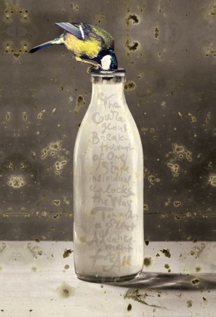
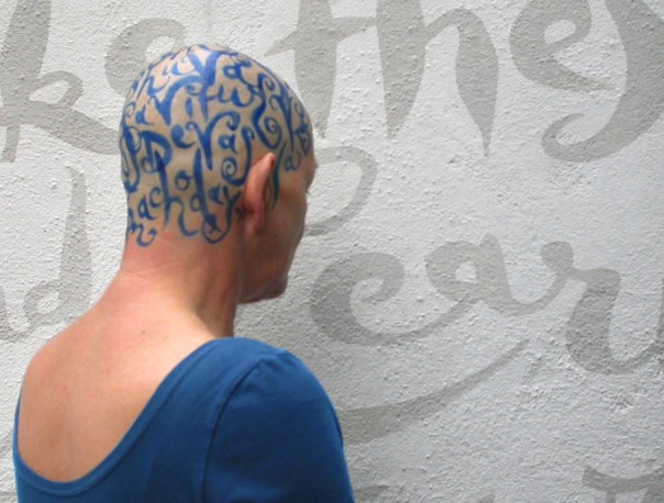
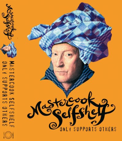
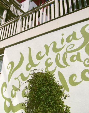
She also makes calligraphies on garden walls and she designs logos based on calligraphies. Further she makes calligraphic photo art, photographic images combined with calligraphy. ‘I would have liked to do more with calligraphy, for example being taught by Japanese and Chinese calligraphers who work with large brushes. There is a wild Japanese artist who makes calligraphies with a large brush riding on his scooter at a square.
The Pillow Book
Het heroes are the calligrapher Brody Neuenschwander and Peter Greenaway, the director who brings calligraphy an essential component in in his films ‘The Pillow Book’ and ‘Writing to Vermeer’. ‘In the Pillow Book every body – with a text on it – is a book. I find that amazing. I had the plan to make calligraphies on the skulls of people with alopecia – people without hair -, but there was too little interest.’
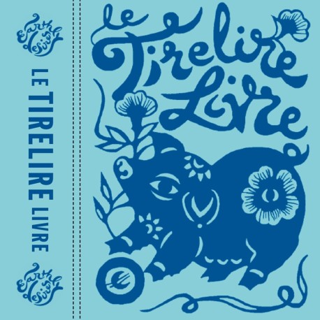
Nicole also is a graphic designer, product designer and interior designer. She designed a nice book ‘Le Tirelirelivre’. When you flip it open it acts as a savings booklet with holes in which you can put euro coins.
Hotels in Turks and Caicos
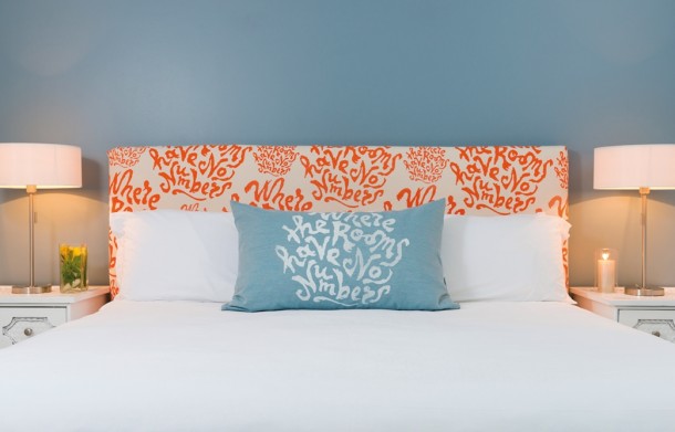
She shows me some bathroom products in different bottles. One is shower gel, another hand cream, there is a pot with liquid scrub, brand Beach House. ‘I designed this whole series for a hotel on an island group in the Carribean, the Turks and Caicos Islands. Waterloo Investment Holding converts existing hotels ‘re-branded’ new in the market. There I’m all round designer for three years, including websites, interior design elements, colors and all the graphic design work. A top job, I go there about eight times a year and work in an international team.’
The islands are located above Cuba and below the Bahamas. ‘About a year ago, the last re-branded hotel opened. There are many New Yorkers who want to take a break.’
A while ago six kite surfers, including four from the Netherlands, and a Dutch captain on an accompanying ship, crossed the ocean starting at Canary Islands to arrive at het Blue Haven Hotel. There was a documentary on TV.
http://ifthenisnow.eu/en/node/163283
www.bluehaventci.com
www.beachhousetci.com
Disclaimer: The views, opinions and positions expressed within this guest article are those of the author Walter van Teeffelen alone and do not represent those of the Marbella Marbella website. The accuracy, completeness and validity of any statements made within this article are not guaranteed. We accept no liability for any errors, omissions or representations. The copyright of this content belongs to Walter van Teeffelen and any liability with regards to infringement of intellectual property rights remains with the author.





The opinions expressed by individual commentators and contributors do not necessarily constitute this website's position on the particular topic.